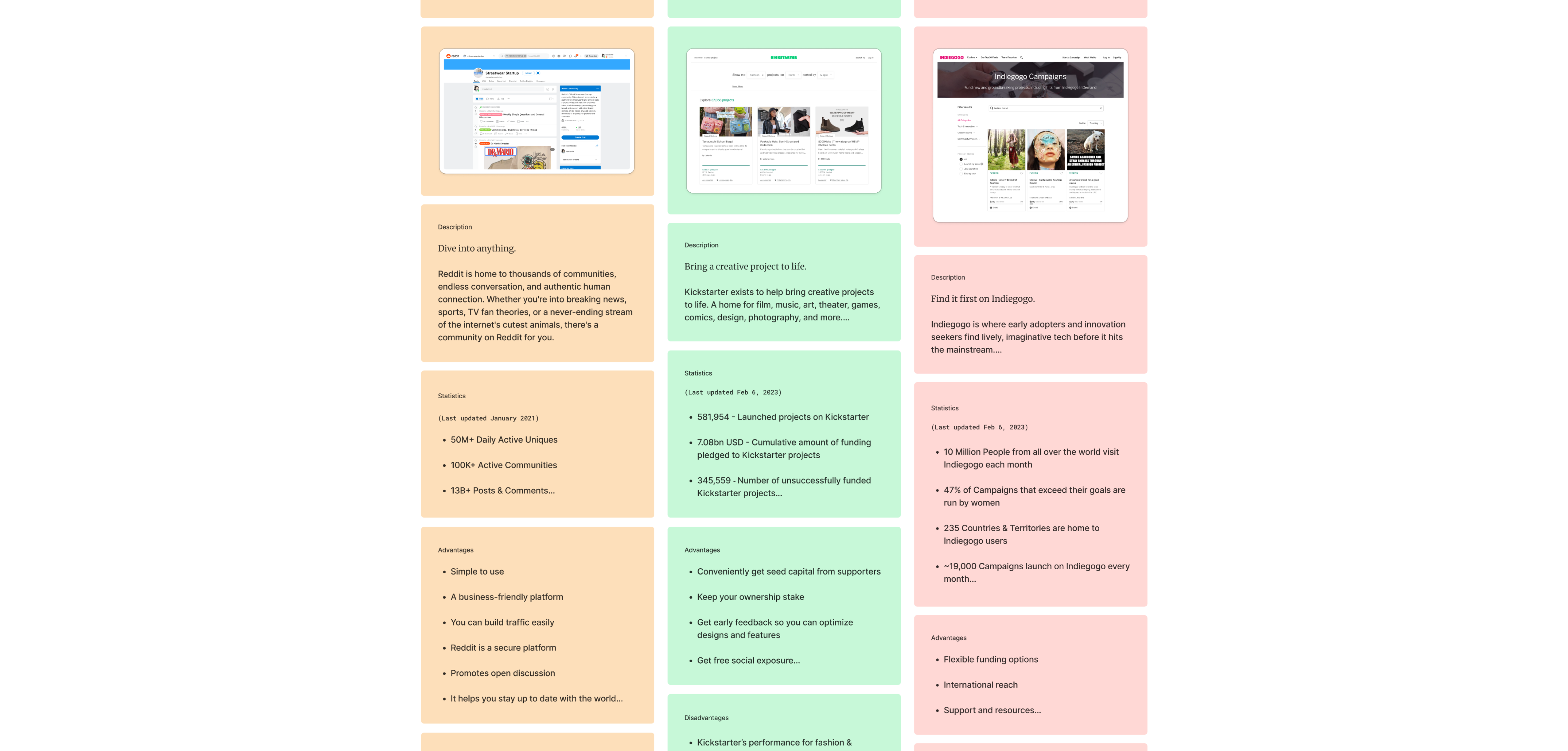
I began with a competitive analysis of crowdfunding platforms: Kickstarter, Indiegogo, and Reddit, to assess gaps and take in what the industry design patterns are, to determine what features the MVP should have. What I noticed was that there wasn’t a dedicated crowdfunding platform specifically for fashion brands, and so using these platforms is not as effective in getting them noticed.
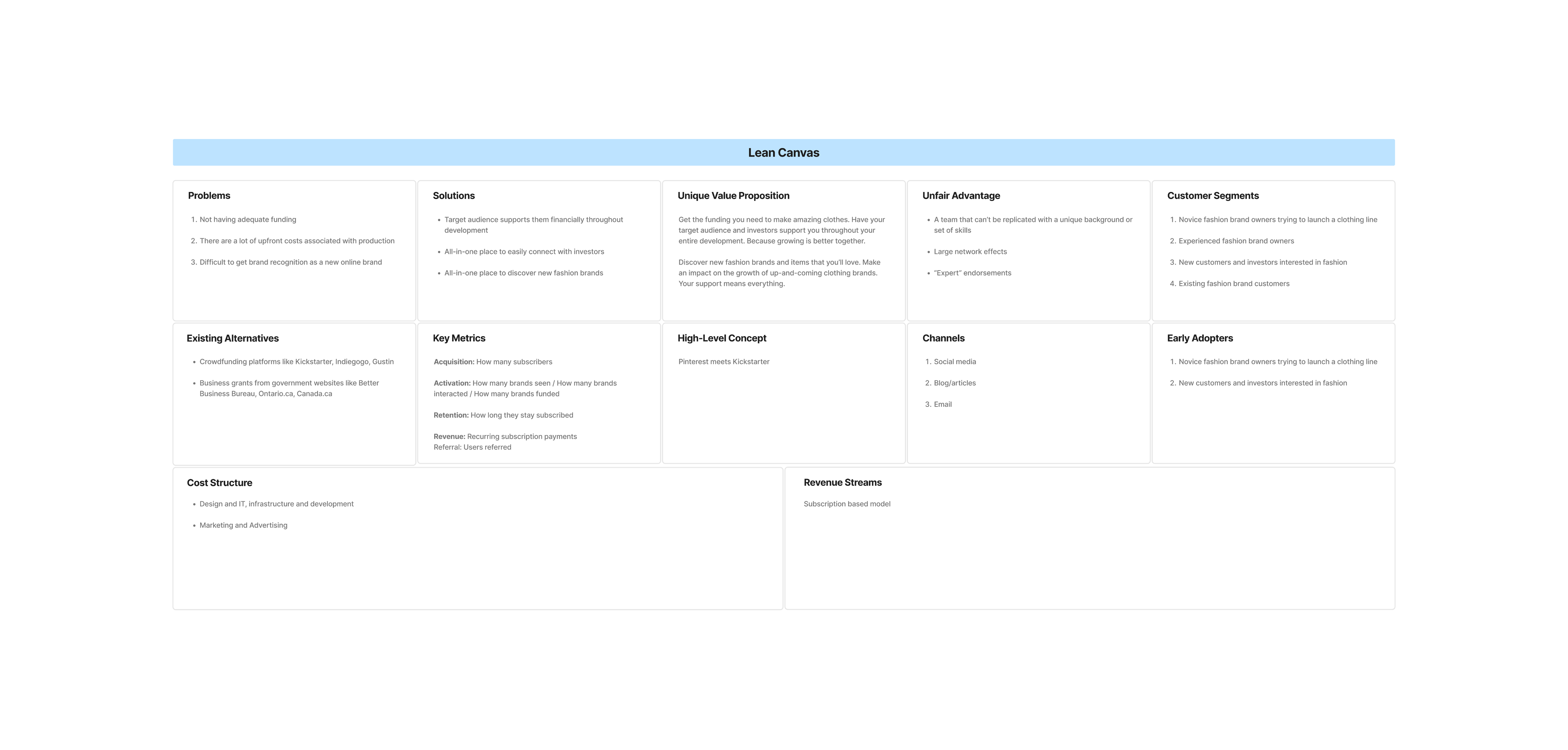
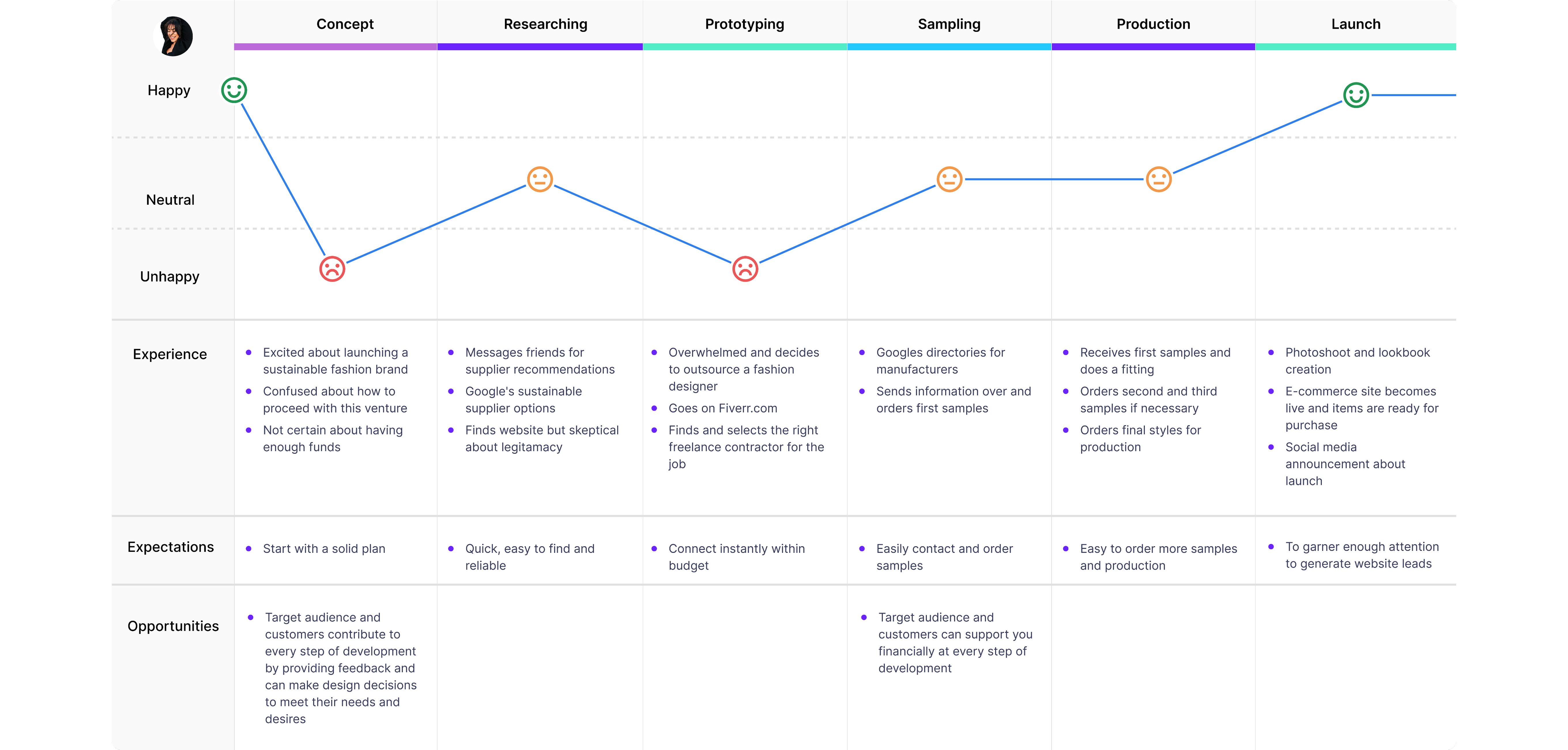
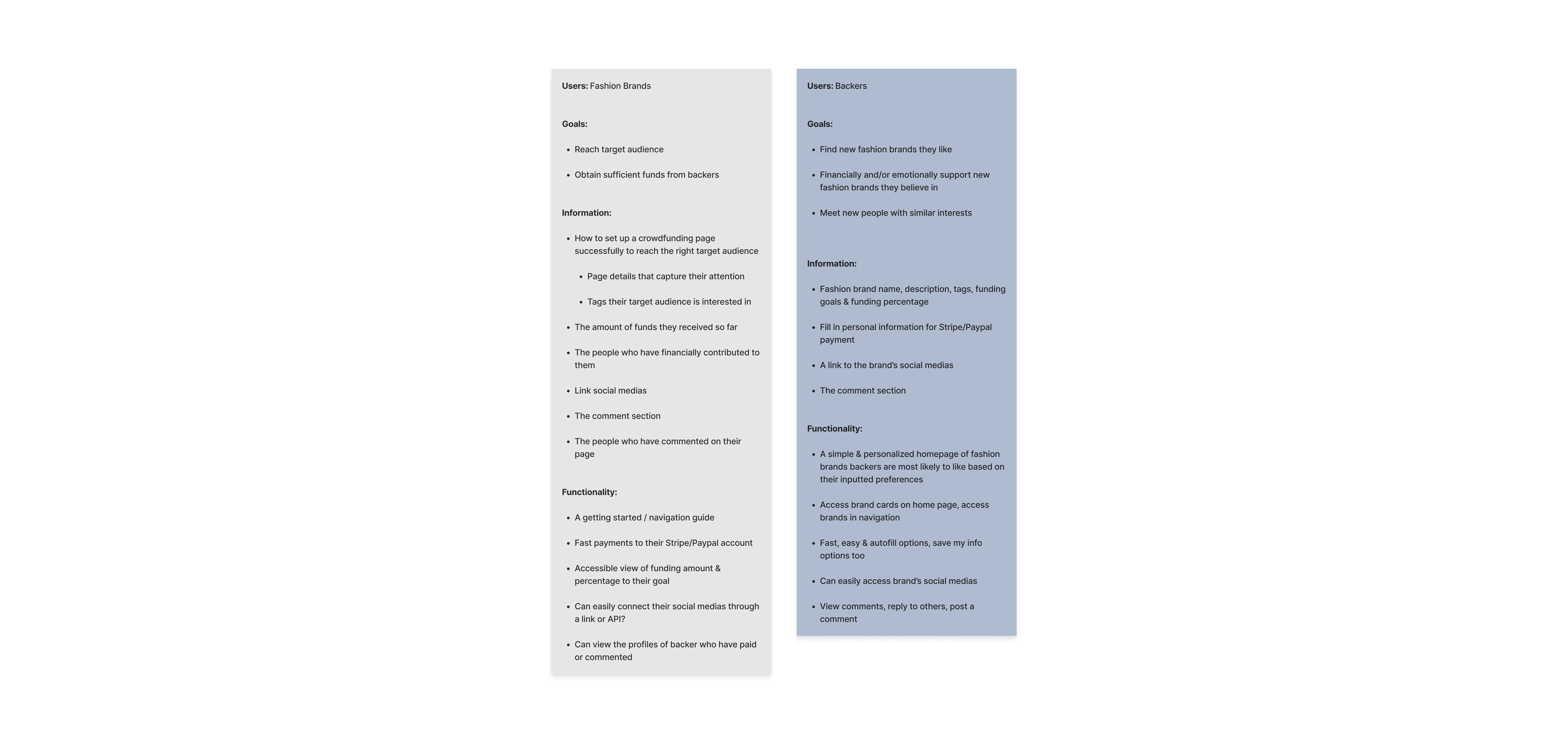
To deepen my understanding of user needs, I conducted extensive user research with a screener survey with over 500 responses and multiple interviews. From this data, I developed two primary personas: Carolyn, a first-time founder overwhelmed by the process of starting a brand, and Jerry, a more experienced founder looking for better reach and engagement. Their journey maps revealed key pain points: unclear next steps, mental overload, and difficulty reaching the right audience, which directly informed the product strategy and MVP features.
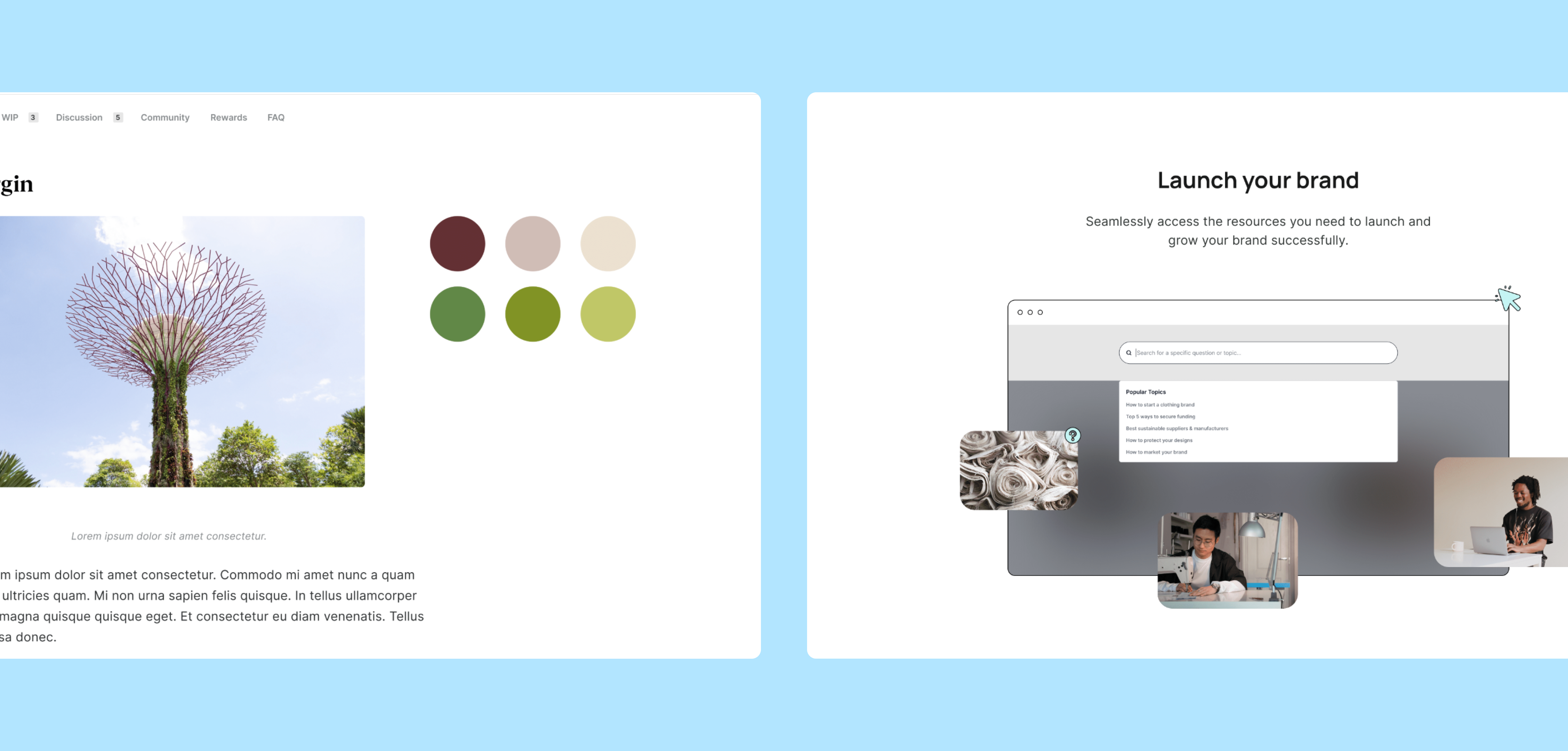
Using these insights, I crafted a brand identity with a teal colour to evoke both energy and trust, and a logo design that forms a link shape symbolizing creative collaboration. The goal was to create a chic and optimistic brand that resonates with Gen Z and Millennial founders.
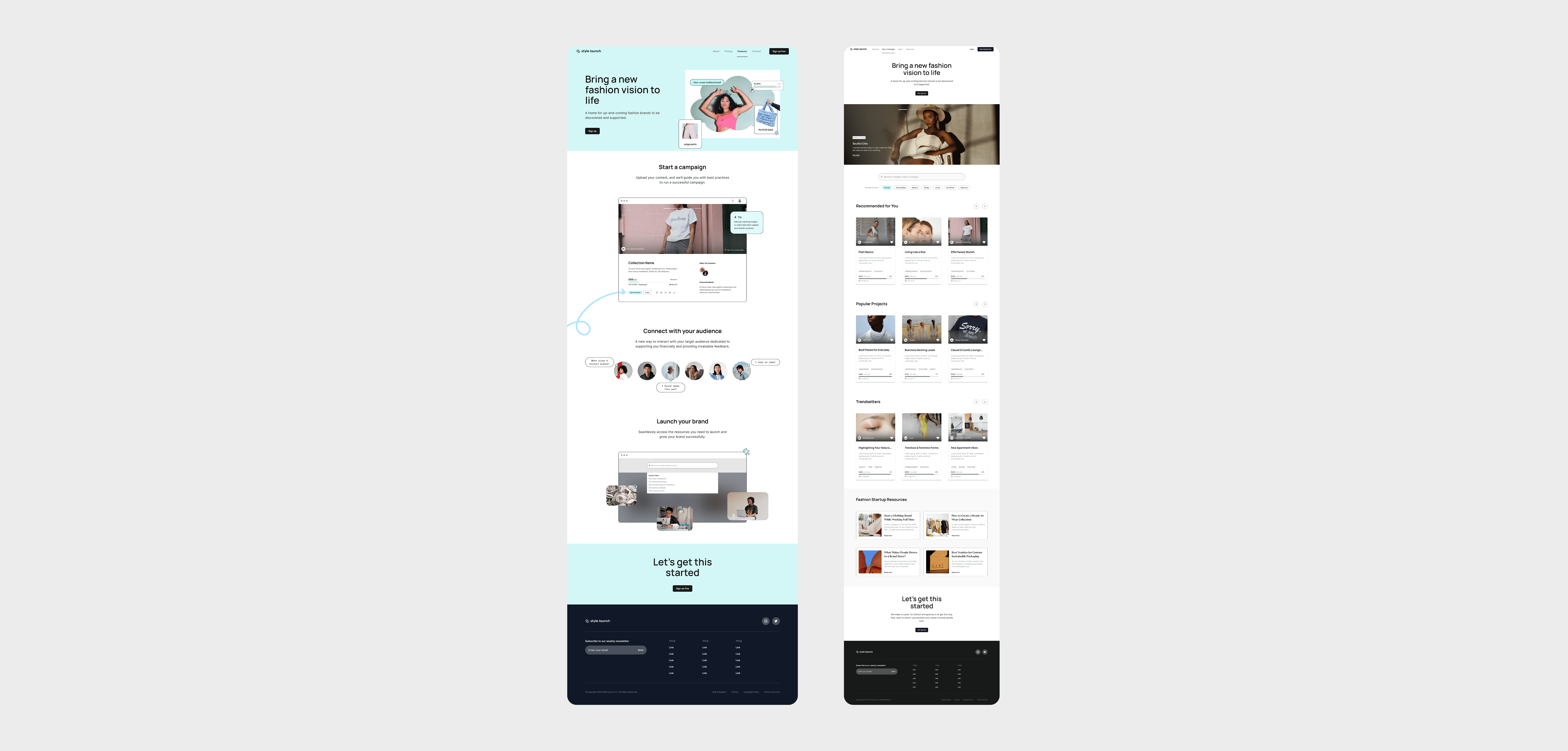
I then structured the information architecture for both the landing page and platform by aligning content with target user goals and familiar mental models from leading crowdfunding and social platforms. For the landing page, I prioritized quick reading and clear conversion paths. For the platform, I focused on a simple and engaging onboarding process, intuitive campaign discovery, and easy access to educational resources.
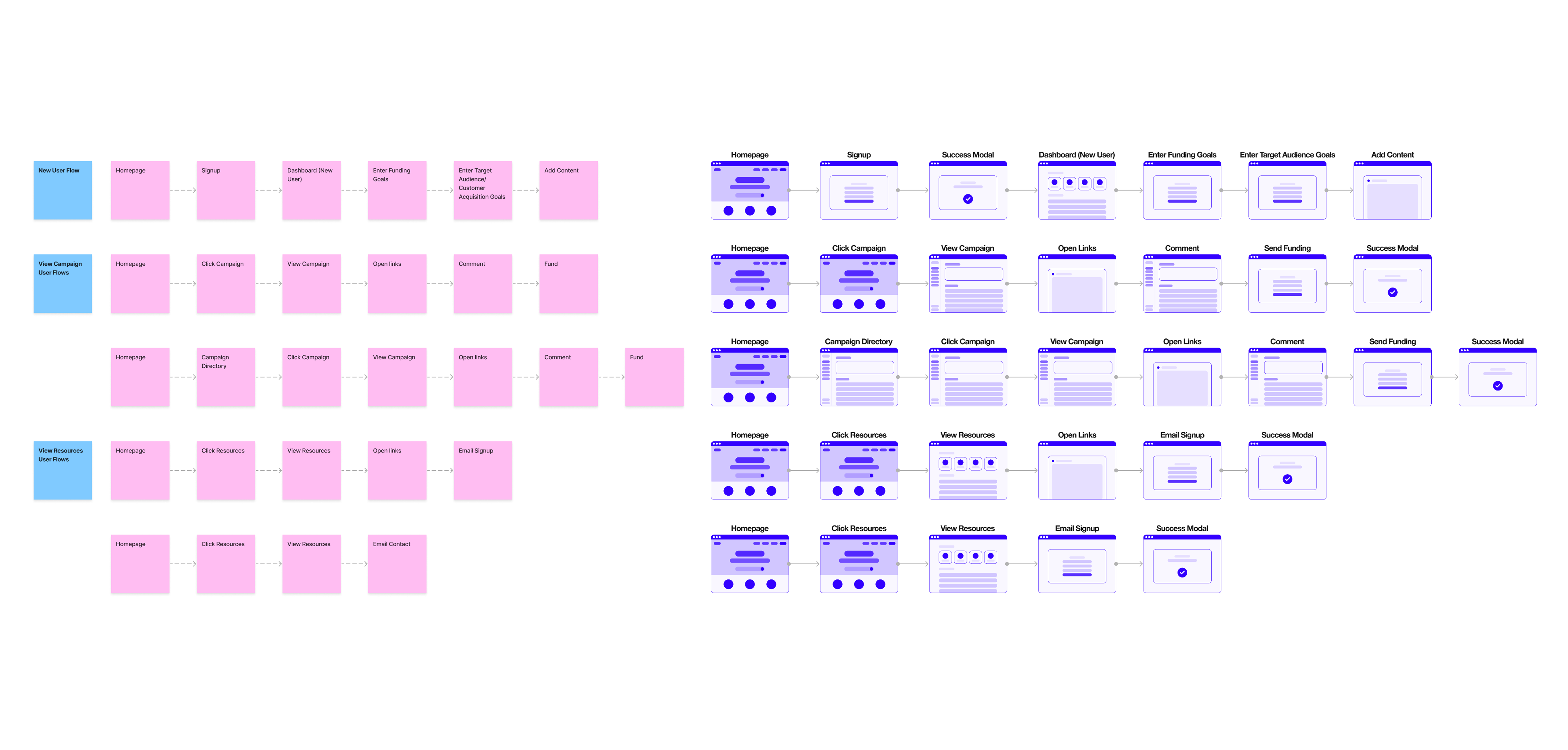
Next, I mapped out essential user flows—such as signing up, creating a campaign, and exploring projects—and converted them into wireflows to visualize interactions and page states. These were a guide for creating the landing page and platform wireframes.
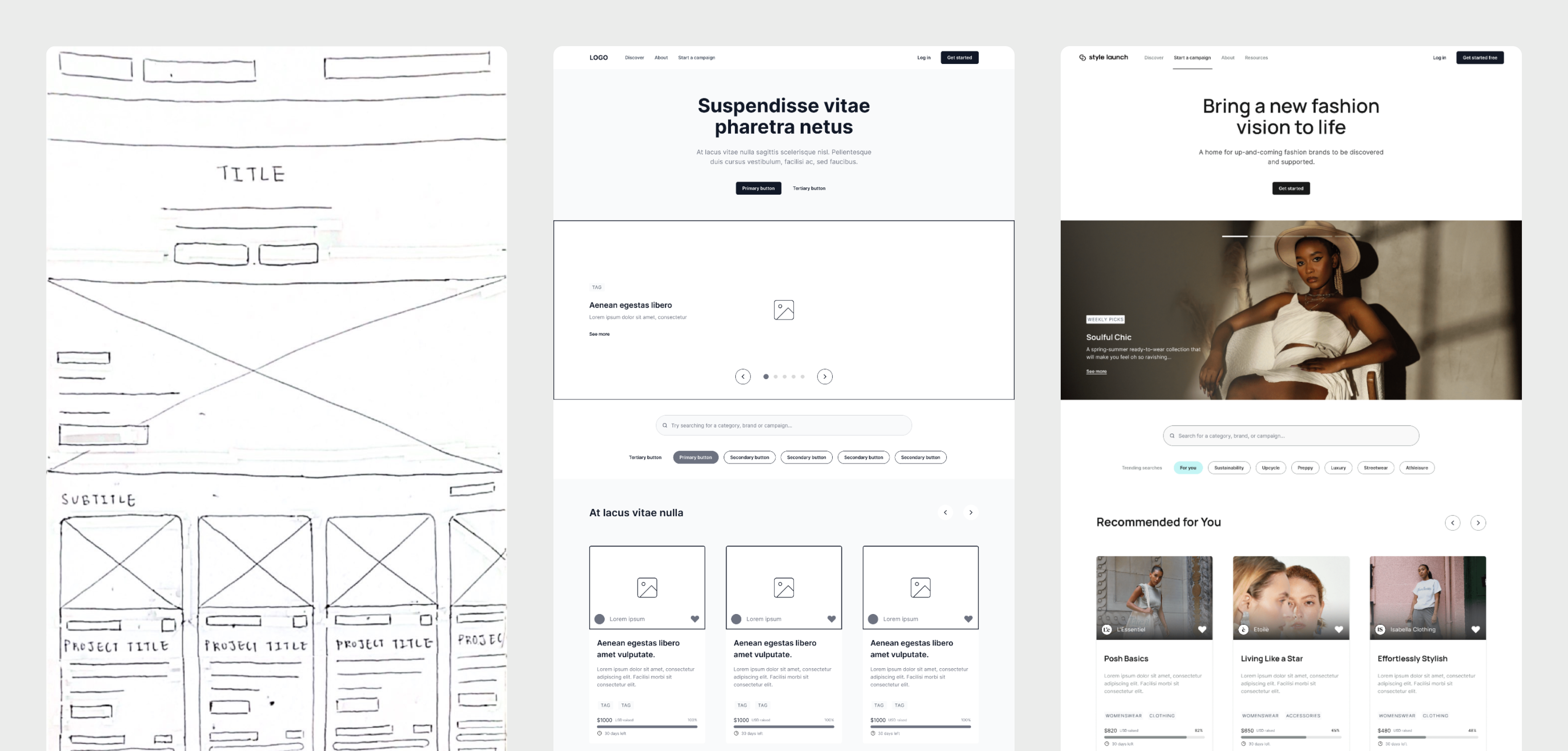
The landing page wireframes and mockup highlight the top MVP features, using strong contrasting CTA buttons and include responsive layouts for desktop, tablet, and mobile. The platform wireframes and mockup use familiar crowdfunding patterns, clean visual hierarchy and generous white space to reduce cognitive load for campaign backers when having to digest many projects at once.